3x BRANDS CROSSING CATEGORY LINES
As categories become increasingly crowded, new brands are having to become more and more creative to achieve real standout. Beyond limited edition runs and collaborations, brands are now looking sideways— drawing from unexpected categories for inspiration.
Whether a brand is trying to show the playful side of its personality, tap into nostalgia or just look cool, using cross category cues brings a pretty endless list of opportunities. Here’s three examples of brands raising the bar by borrowing from different categories.
1. RIHANNA AND MSCHF KETCH AND MAKE UP
American art collective MSCHF are recognised for the remarkable, releasing everything from ‘Jesus Shoes’ to ‘Eat the Rich’ popsicles.
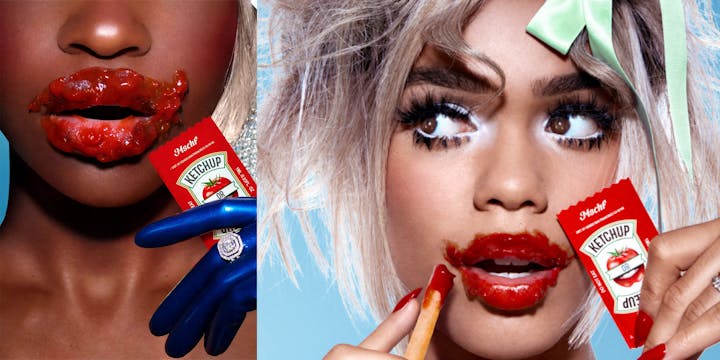
For their 83rd drop they decided to blur the lines between condiment and cosmetic, collaborating with Rihanna’s Fenty Beauty in a ‘Ketchup or Makeup’ partnership.
In a sort of Rihanna-roulette, boxes are filled with ketchup packets containing either tomato ketchup or Fenty beauty lip gloss.

Image: MSCHF x Rihanna
The identical exteriors make it impossible to tell the difference before application, with only a taste test revealing if the packet is best served with blush or fries.
Thin boxes are made long enough to separate packets into individual spaces (because who would want to mix their makeup with their ketchup right?) with a minimal ‘Makeup or Ketchup’ embossed on the lid.
The collab is certainly standout, and with Rihanna’s long-established status in the fashion world — a status that continuously elevates the brand position of Fenty Beauty — the stunt is a welcomed opportunity for the brand to show its playful side.
2. VACATION WHIPS THEIR SUN CREAM
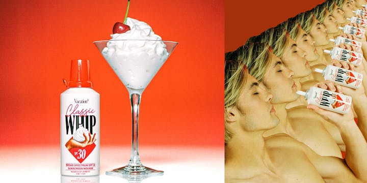
Known for their nods to nostalgia and love of everything 80s-ish, luxury sun cream brand Vacation delved into the vintage dessert world to release their ‘Classic Whip’ sun cream.
Squeezing out a surplus is never a bad thing when it comes to sun cream, so their SPF 30 mousse takes inspiration from the old-school dessert you can never get enough of – whipped cream.
The exterior is kept simple with a white can, red lid combination, making it difficult to realise it’s a not-so-classic whip. Inside, you’ll find a vitamin enriched recipe, referred to by scientists from Honeywell as ‘dessert for the skin’.

Image: Vacation
Sun cream packaging seems to be an area that’s heating up more generally too. Crèma Colada’s latest packaging for their creamy cocktails takes cues from vintage sun creams, hoping the memories evoked by the bottles assert their status as the go-to summer drink.
The ever-increasing trend towards nostalgia is something we are all aware of by now but using borrowing to tap into this trend is a move we aren’t as familiar with. The originality leaves us with a product that isn’t trying too hard to be retro or cool, and as a result achieves both these things in an understated way.
In this instance, cross-category packaging afforded Vacation a stylish opportunity to tune into trends without compromising on their nostalgic aesthetic.
3. ENGINE GIN MERGES CATEGORIES
Most of us were raised with the basic knowledge to not mix drinking and driving. Luckily for ENGINE gin, this majority doesn’t include its founder, Paolo Dalla Mora.
The brand was first conceived while Dalla Mora was drinking the traditional Langa digestive in his garage. Since “it all took shape in my garage, I thought it would be suitable for ENGINE to have an identity that fits with that”, Dalla Mora says.

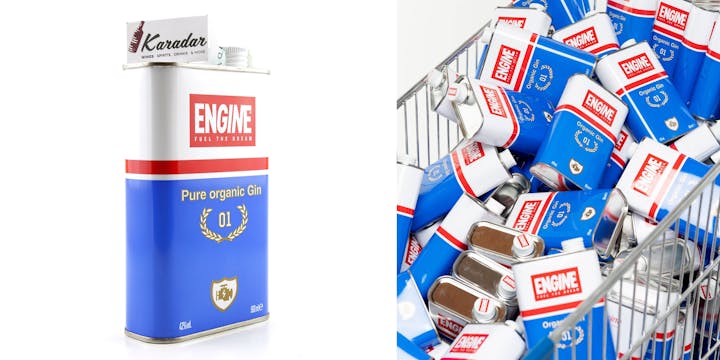
Image: Engine
Contained in a 50cl tin can, the packaging transcends traditional bottles to greet supermarket shelves with the unexpected. The can mirrors motor oil containers, with the tagline ‘fuel the dream’ neatly tying the two categories together.
In a category largely populated by floral and botanical designs, using packaging that cuts through the typical tropes of the gin world leaves us with a product that is hard to ignore.
The packaging speaks to the story of the brand in a fun and unique way, using distinctive design to achieve a position of real standout that we won’t soon forget.
Words by Caitlin Coyle, Junior Copywriter.
SEEN is our monthly-ish 3x3 newsletter about brands, trends and creativity. Subscribe by getting in touch here: hello@lovecreative.com.