3X BRANDS PLAYING WITH POP-UPS
When we think about the brands that feel memorable, it's often the ones who flaunt their playful side that create the most cut-through. And when it comes to creating physical brand spaces, it’s no different. Embracing the fun can mean lots more room to play with.
From iconic fashion retailers to milk with a message, we’re noticing more and more brands connecting the dots and putting their silliest foot forward when it comes to pop-ups.
Here are three brands finding the balance between work and play with fun IRL spaces:
1. THE SELFRIDGES JOKE SHOP
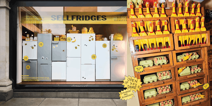
Where puns meet purses, Selfridges latest iteration of their ‘Corner Shop’ installation saw them take a funny approach to shopping. Visiting some of the UK’s most iconic joke stores for inspiration, the in-house team created a ‘shoppable comedy store’ aptly named The Joke Shop.
Popping up on the ground floor of their flagship department store, they created a fully immersive experience filled with ‘Gifts of the Gag’ and ‘Laughing Stock’. The result is a ‘Tongue in Chic’ space where sneezing powder and Whoopee cushions play neighbour to designer pieces from the likes of Judith Leiber and Adam Jones.

Image: Selfridges
According to ECD Laura Weir, the idea was to create a space that would “platform the power of nostalgia and in-person human connection”. By commissioning installations to re-imagine classic jokes (including a trainer-clad banana slipping on its own peel), and sourcing as many vintage pieces as they could, they seem to have nailed the punchline. Apparently, the pop-up was so similar to a genuine joke shop, one visitor asked what they used for the smell.
2. OATLY’S FOUNTAIN OF YOUTH
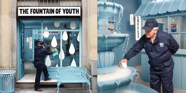
Popping up at Milan Design Week with their very own ‘Fountain of Youth’, Oatly are out to convince us that the mythical elixir of life is not actually water, but oat milk.
Wrapped in a whimsical sky blue, their pop-up put a surrealist slant on a picturesque park, with potted flowers, lamp posts, and benches lining the outside and drawing focus to the milk feature that trickles down the fountain’s tiers.

Image: Oatly
While Oatly’s quirky tone of voice has already earned them a spot in the playful brand’s hall of fame, channelling this spatially further cements them as kings of the category. Instead of milking their morality, Oatly campaigns for serious causes like climate change and animal rights in a funny way– and they’re all the more memorable for it.
3. COACH’S INFLATABLE POP-UP
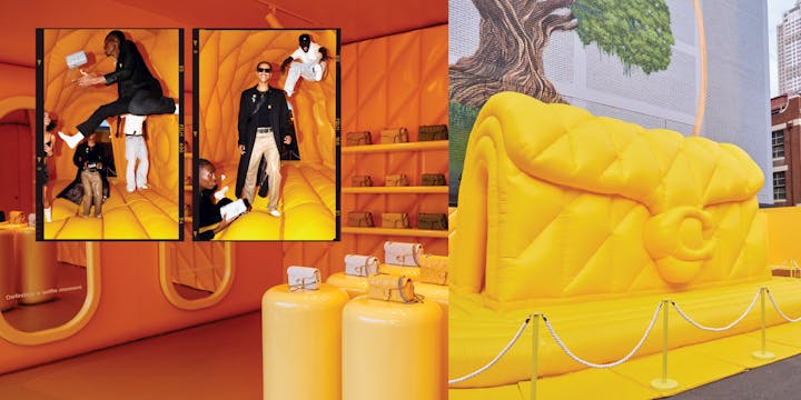
In celebration of their iconic Tabby bag, Coach recently created an equal parts playful and pillowy pop-up. Capitalising on the viral #pillowtabby TikTok that has over 16 million views, the space bounced off the idea that a bag could be so soft it could double as a pillow.

Image: Coach
From bespoke Tabby-inspired sponge cakes to a giant handbag bouncy castle and flower-filled ‘Daisy Daydream’ installation, Coach imagined the Tabby in every way possible – creating an ultra-plush world where even the walls were quilted.
Set in a car park - in a handbag - Coach brought the spirit of New York to Melbourne, turning a grey urban space into a dreamlike world. The result was a unique experience that celebrated the power of "self-expression and the spirit of discovery" that Coach has become renowned for.
Words by Caitlin Coyle, Junior Copywriter.
SEEN is our monthly-ish 3x3 newsletter about brands, trends and creativity. Subscribe by getting in touch here: hello@lovecreative.com.