SK-II
Andy Warhol X SK-II
- Brand Strategy & Design
- Packaging Design
FEATURED IN
-
Creative Review
It's Nice That
Dieline
PRINT
Packaging of the World
Heromag
El Poder de Las Ideas
Graphic Design USA
Creative Boom
World Brand Design
Design Rush - packaging
SK-II and The Andy Warhol Foundation were looking for a concept as cool as their skincare collab. We saw the opportunity to tap into the artist’s extensive archive and create an Andy-approved aesthetic centred around a shared love for beauty.
THE CHALLENGE
Known for their annual drops of culture-led collabs, SK-II’s ethos is one of empowerment and affirmation. Over the years, their SK-II Facial Treatment Essence has garnered a cult following from a younger audience – leading to regular, limited edition releases dotted across the beauty calendar.
When SK-II partnered with The Andy Warhol Foundation to create the latest edition of their Facial Treatment Essence, they needed a concept, visual identity, and packaging to appeal to trend-conscious consumers in Asian markets. Our job was to find and highlight the deeper connection between these two cultural behemoths.
OUR RESPONSE
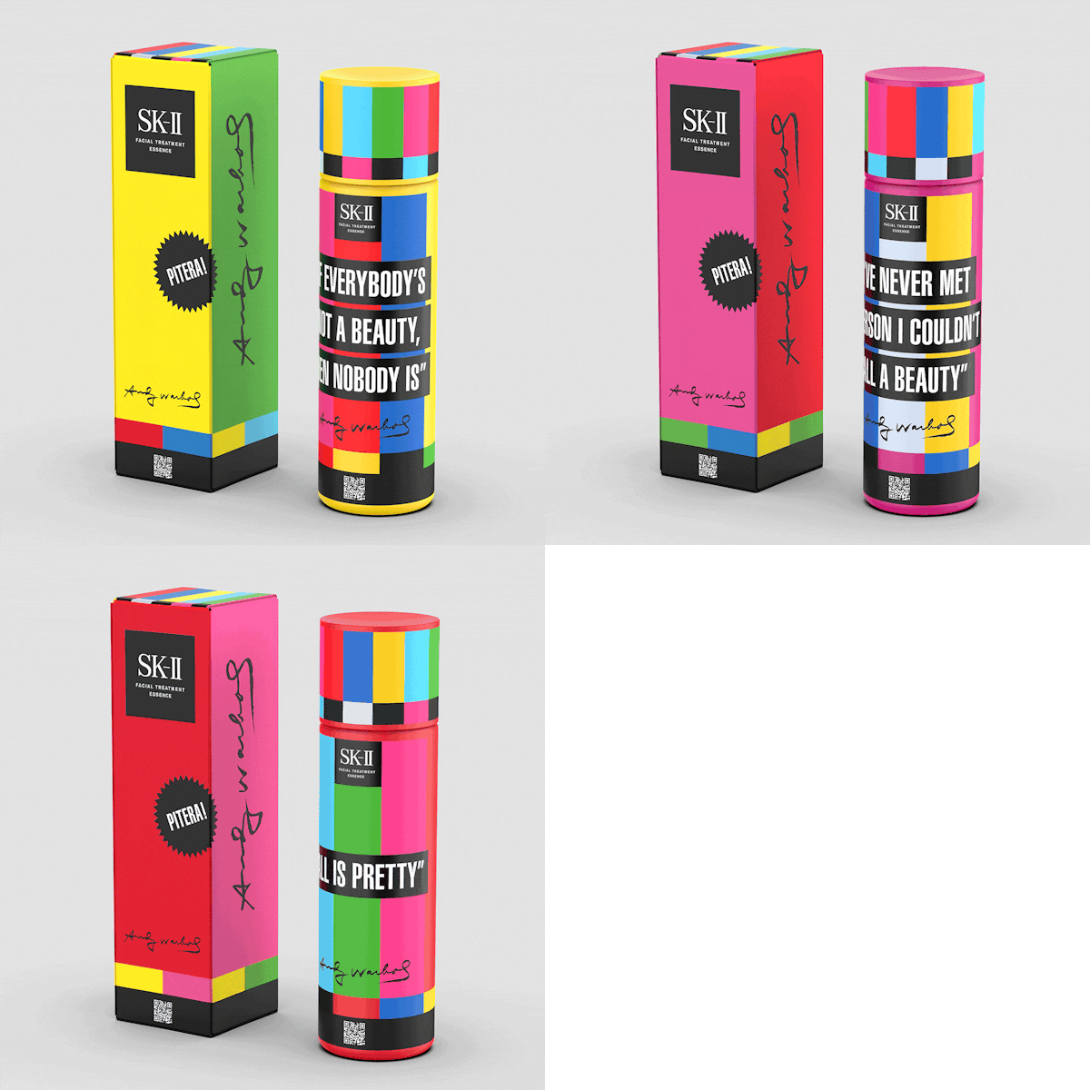
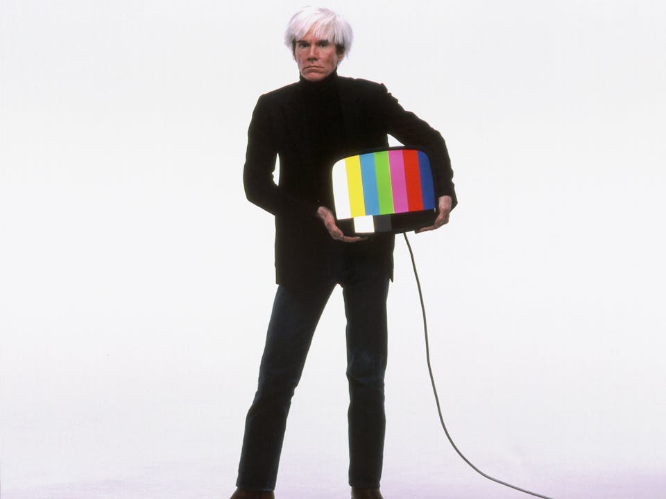
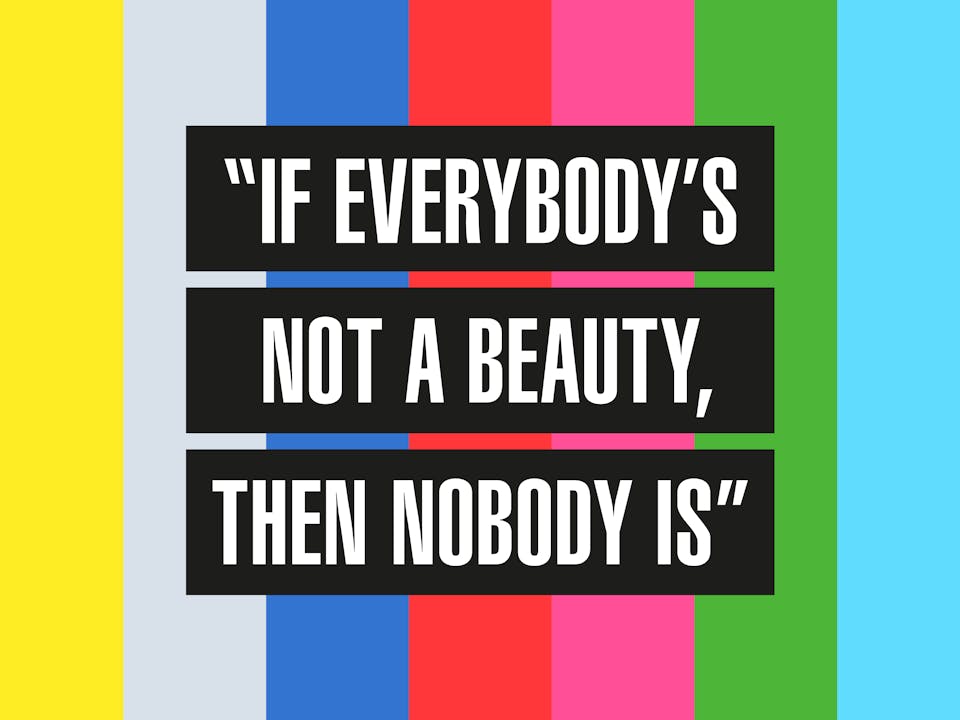
A skincare junkie himself, Warhol’s take on beauty was both empowering and inclusive. Having been quoted as saying “If everybody's not a beauty, then nobody is”, it was his view that beauty lies within everyone. We wanted people to re-hear that message.
Taking inspiration from broadcast media — another of Warhol’s passions — we asked the world to “broadcast your beauty”. And by using his iconic television test pattern, we created a technicolour campaign ready for transmission.

THE BEAUTY BROADCAST
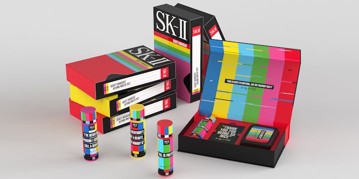
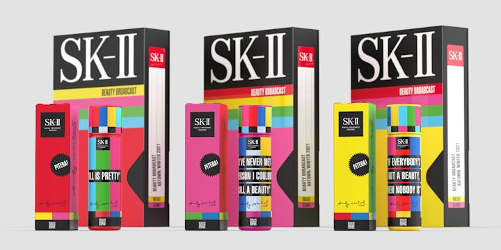
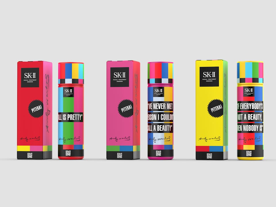
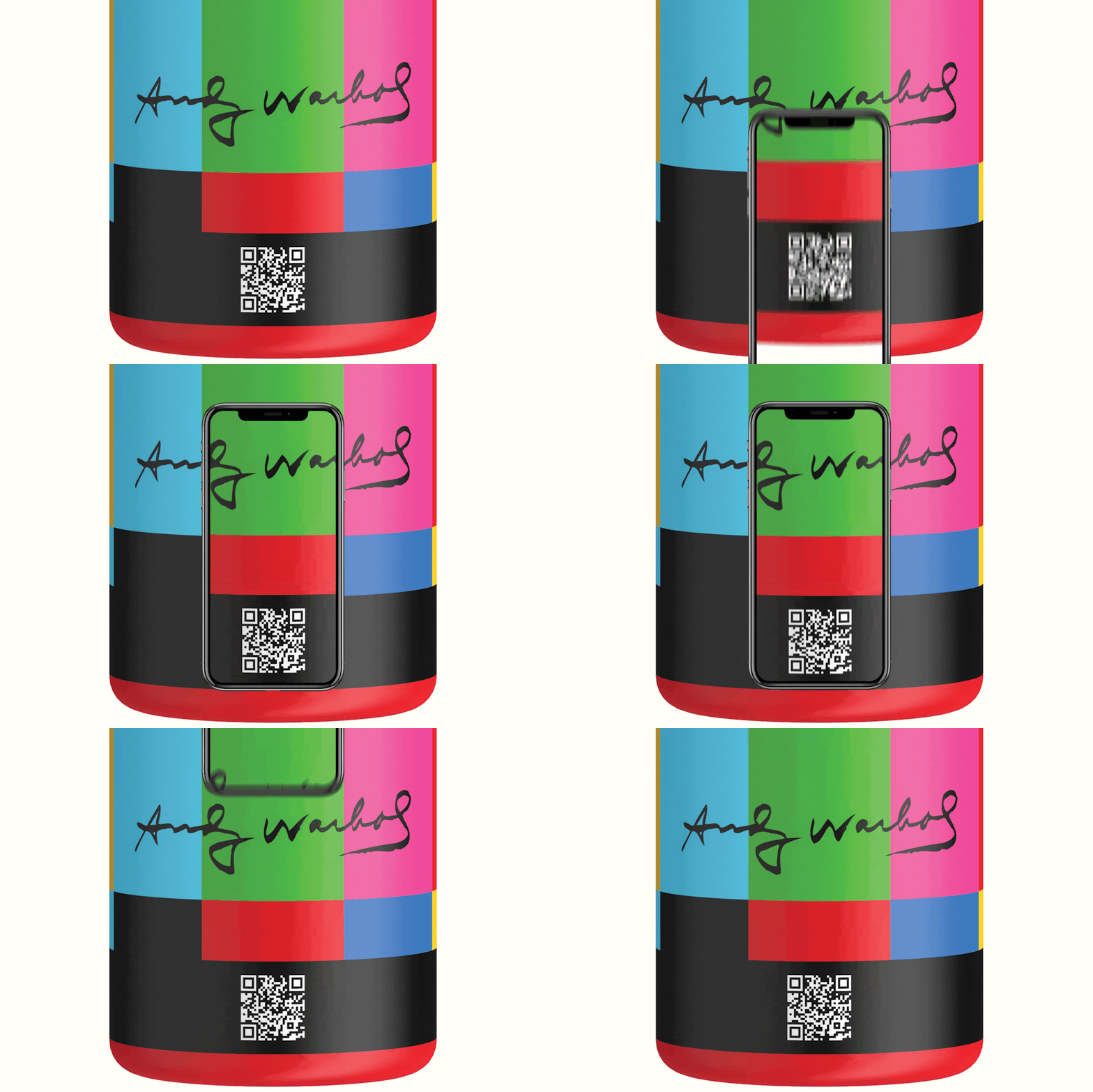
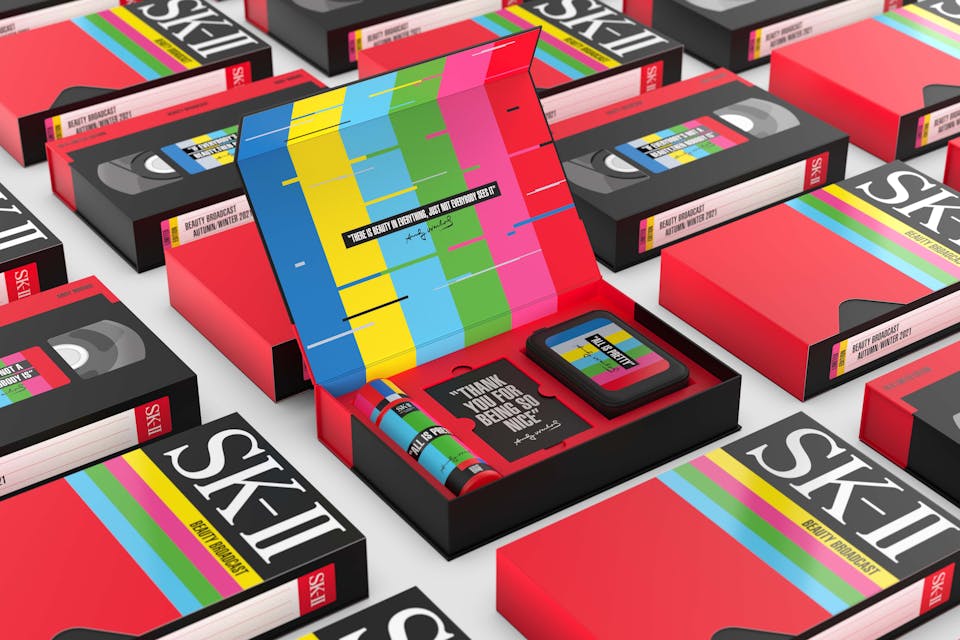
The outcome was three sets of limited-edition packaging wrapped in bold, nostalgia-inducing colourways and emblazoned with quotes from Warhol himself. Packs also featured a QR code to unlock even more broadcasts from the SK-II brand.
Kicking up the nostalgia for our gift packs, packaging was designed in the shape of VHS tape boxes and analogue TVs to create a skincare set straight out of the MTV era.
Taking our campaign to the big screen, our mood film colourfully captures Warhol’s iconic technicolour test pattern – televising our message and creating a powerful beauty broadcast to remember.
THE RESULT
Having launched in November 2021, the collaboration has already turned the heads of a number of global media outlets, including Creative Review whose readership tips the 3 million mark. Coverage was also included in It’s Nice That, which reaches 2 million readers, Creative Boom, which reaches 750,000, as well as the 451,000 followers of the World Brand Design Instagram account.
