HÄAGEN-DAZS
HÄAGEN-DAZS BRAND RESET
- Brand Strategy & Design
- Identity Design
- Packaging Design
- Spaces
RECOGNITION
-
DBA Silver Design Effectiveness Awards
When Häagen-Dazs needed to recapture young consumers’ attention, we saw that taking a step back to revisit the brand’s founding principles could turn into a major leap forward.
THE CHALLENGE
Häagen-Dazs was once the go-to luxury ice cream. But in 2017, while the product itself remained peerless in terms of quality ingredients, the brand’s packaging and wider identity was looking out of touch with modern consumers and the Instagram era. Our challenge was simple: get Häagen-Dazs back to its accessible luxury best.
OUR RESPONSE
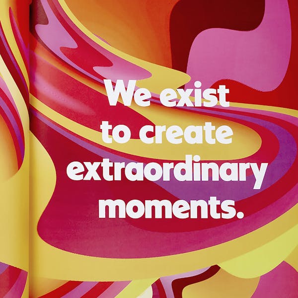
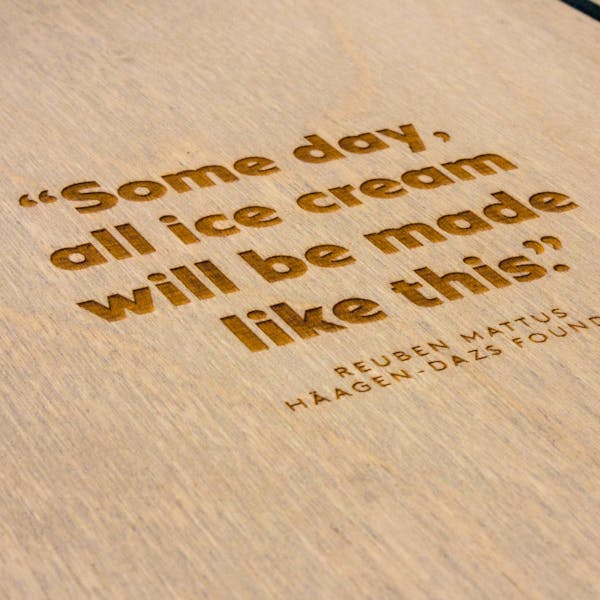
We revisited the brand’s roots in 1960s New York and discovered the story of a Polish immigrant turned entrepreneur who dreamed big. Really big. Obsessed with quality ingredients and inspired by the elegance of Scandinavian design, founder Reuben Mattus had set a course we wanted to follow.It was time to reintroduce the core design principles of simplicity, balance and proportion to the Häagen-Dazs brand identity.
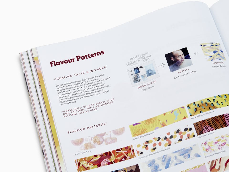
The flavour experience
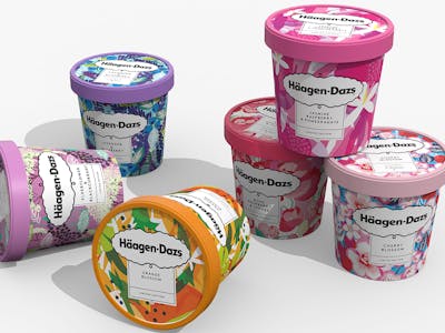
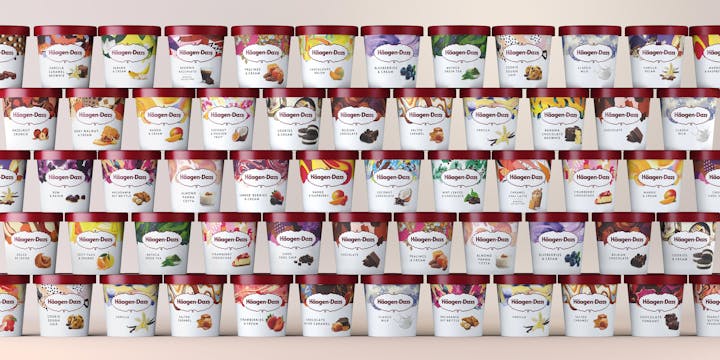
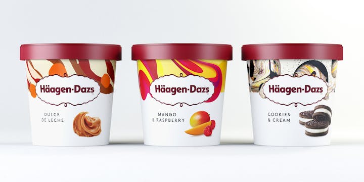
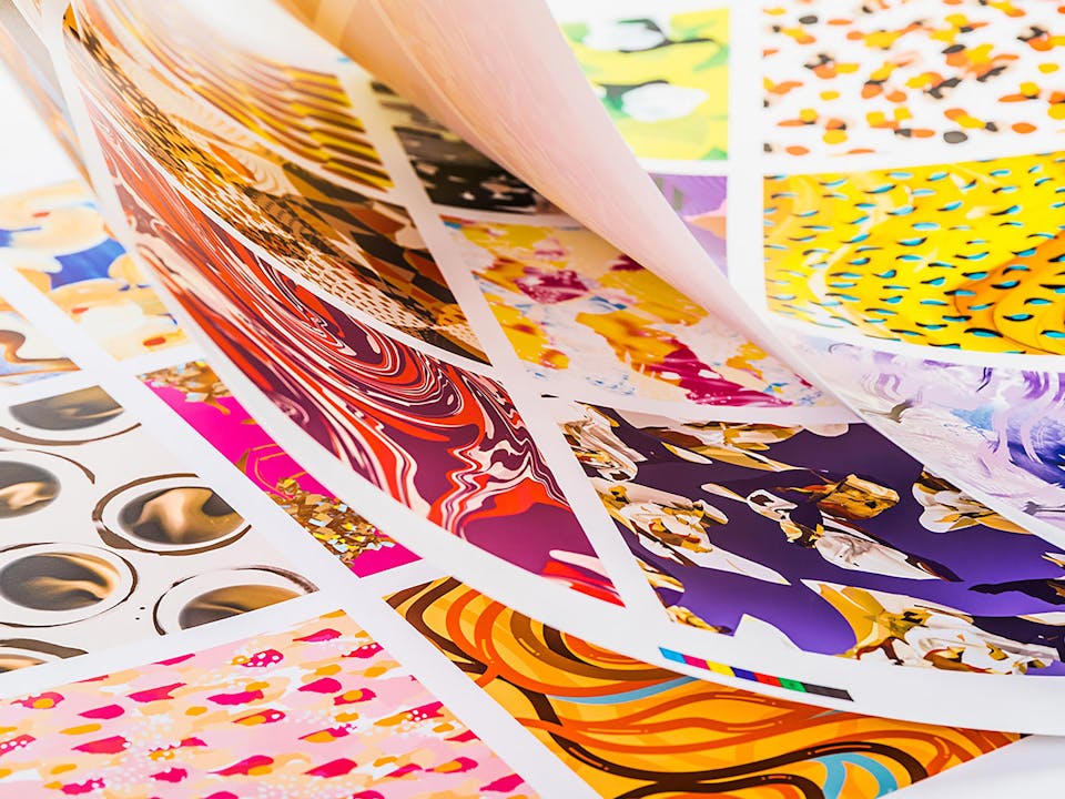
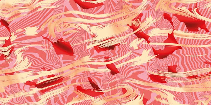
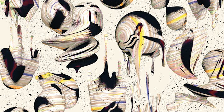
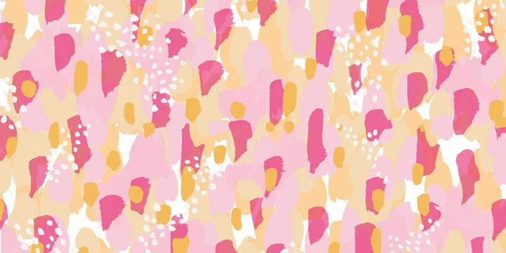
We felt the brand had become a little… well, vanilla. Our aim was to make every Häagen-Dazs pack an object of desire. We commissioned artists and designers from around the world to interpret the flavour experience of each product, challenging them to bring those extraordinary textures, colours and sensations to life in a unique pattern. More than 50 flavours were taste tested (well, somebody had to do it) before we paired artists with the flavours that best suited their style.
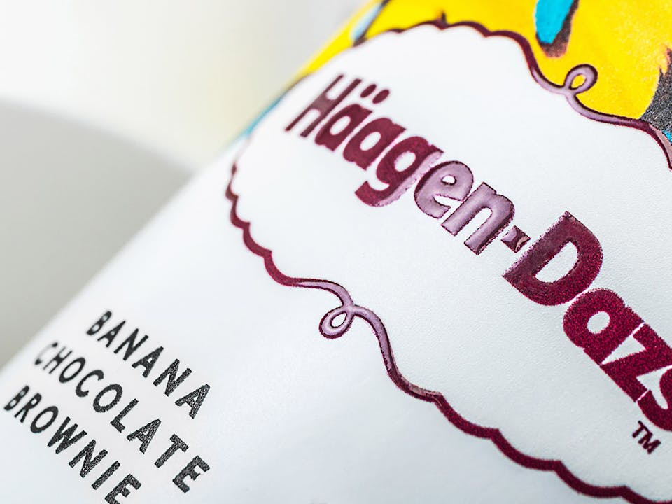
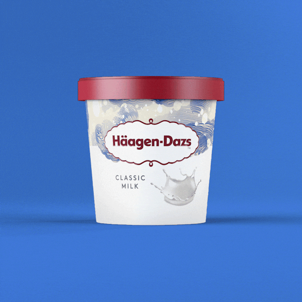
These bespoke patterns, created by artists including Santtu Mustonen and Kustaa Saksi, became the core feature of all Häagen-Dazs packaging. In the spirit of Scandinavian restraint, we simplified the brand’s iconic logo from a two-colour black and gold mark to an elegant mono burgundy version.


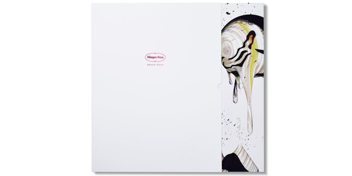
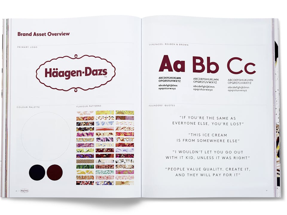
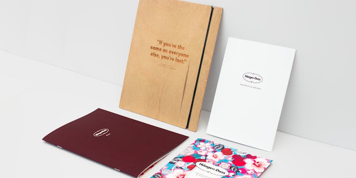
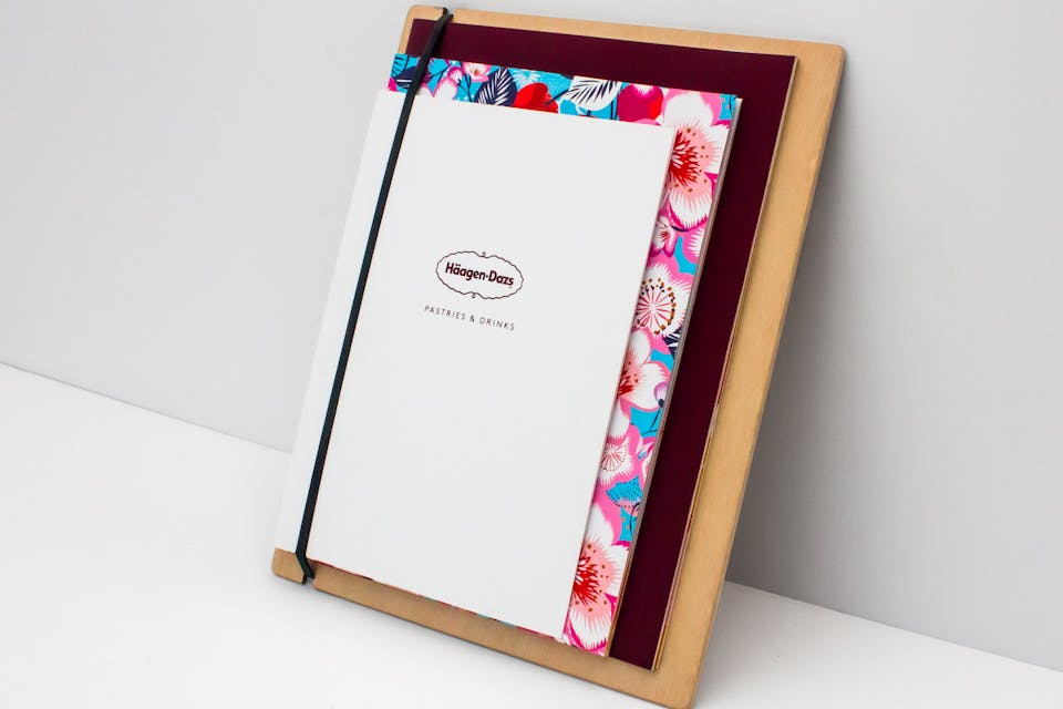
Read all about it
The new look and tone of voice was enshrined in a large-format, ‘lookbook’-style brand bible to inspire the global marketing team.Everything you need to know about the best ice cream in the world.
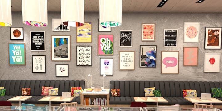
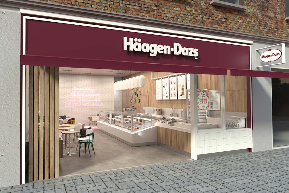
The retail revolution
Häagen-Dazs’ shops were also in need of a refresh. Using the brand story to inform every design element, we developed a global retail scheme to create the kind of ice cream shops our audience would want to see – and be seen in. Spaces fully connected to the packaging identity, reflective of Scandinavian design and full of Instagram-ready moments. The scheme was designed to flex across six different shop formats, covering 850 outlets globally.
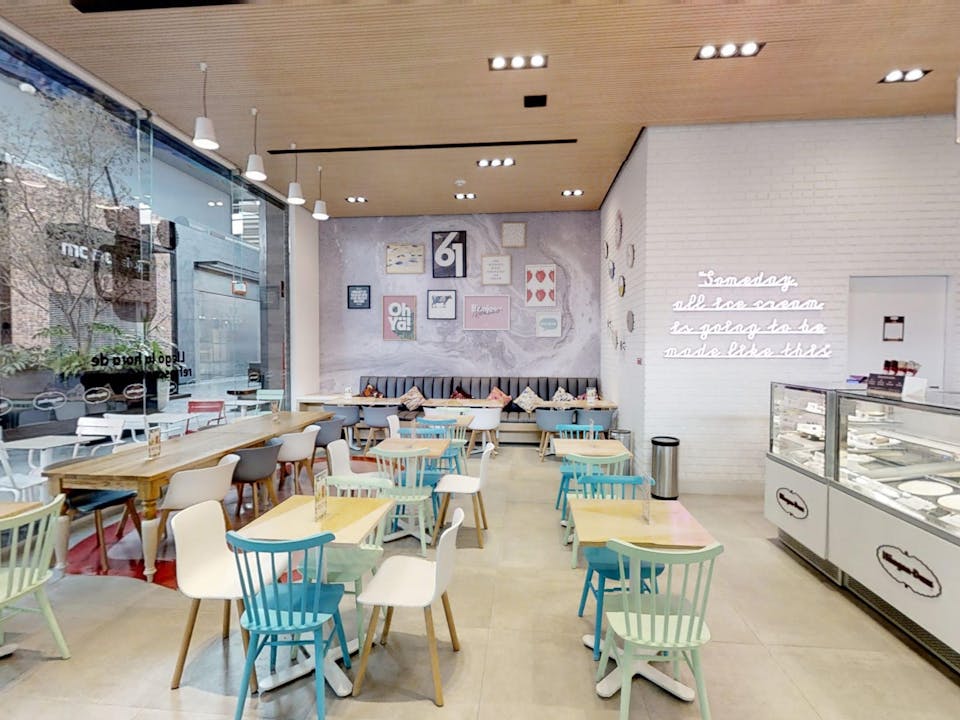
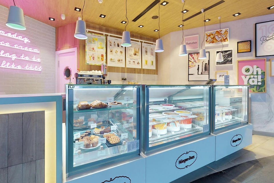
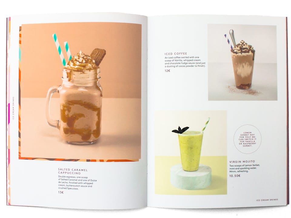
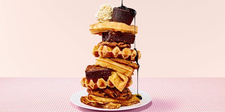
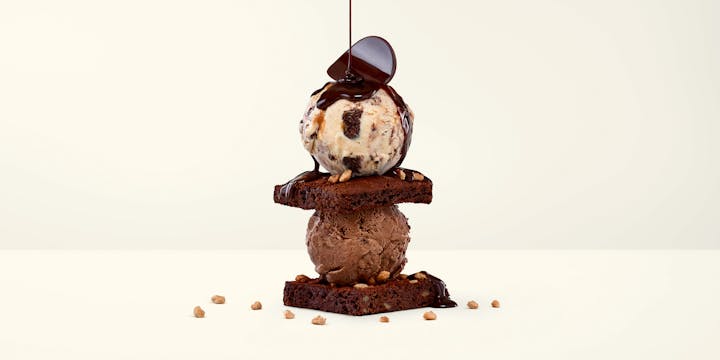
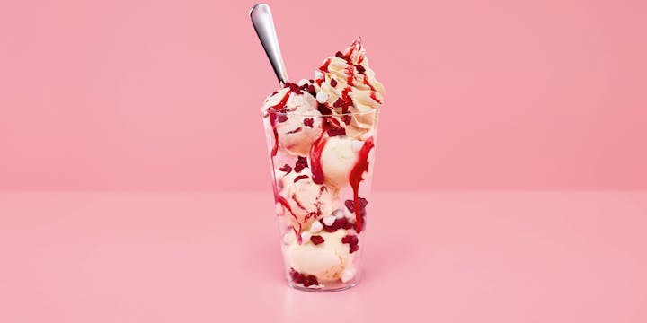
Taste appeal
To support the renovation of the retail estate, we also carried outa complete menu design overhaul. In came fresh, minimal product photography, a sharper tone of voice and a new functional format for both physical and digital outputs.

Stand out to sell out
Häagen-Dazs immediately saw sales increase by 66% after the packaging redesign launch. Over the first 12 months, the brand reported a 37% uplift in annual UK sales, resulting in a +1.7% jump in UK market share.
In 2018, our retail redesign began its rollout across Europe and Latin America, with refurbished stores showing average sales growth of 22.9%. In just six months, sales grew from $150m to $184m.
UK Sales Increase
66%
Ireland Sales Increase
100%+
Social Media Grew
500%
Brand Growth
37%