HENDRICK'S
G&TEA TIME AT THE HENDRICK'S HOTEL
- Packaging Design
FEATURED IN
-
World Brand Design
Unipack
Creativ Verpacken
Dieline
GQ
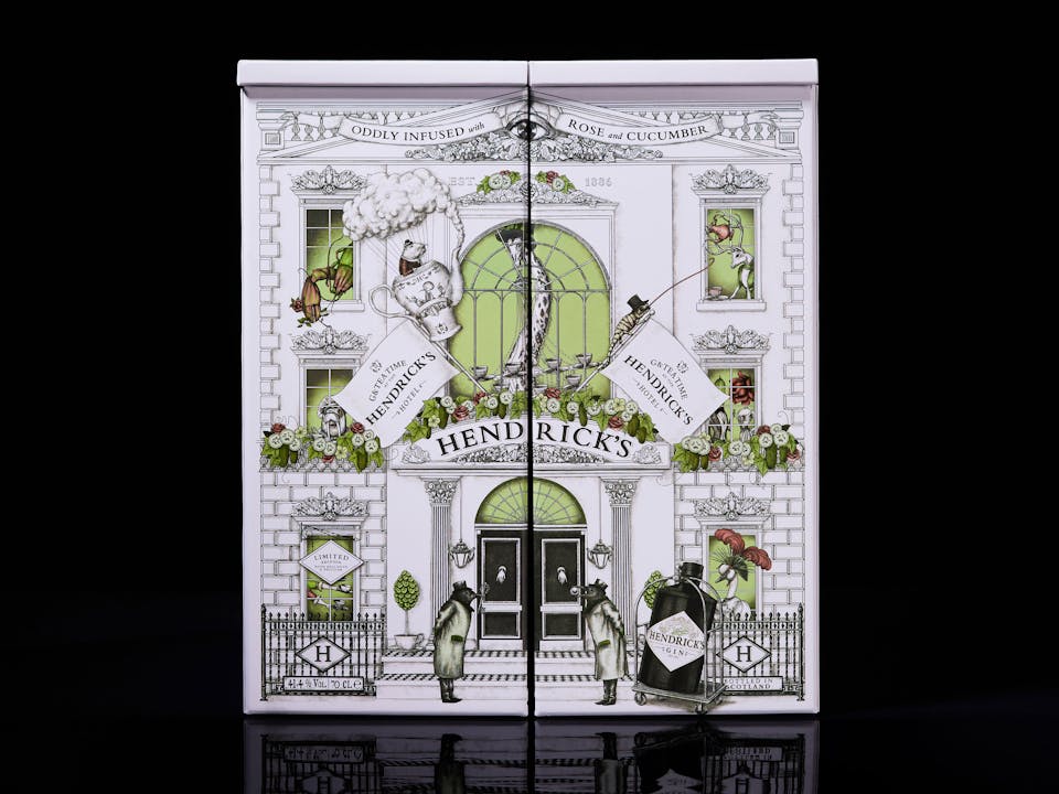
Hendrick’s wanted to reimagine their famous tea set around a hotel concept. A limited-edition pack to help the brand occupy more premium retail spaces. We built it from the ground up.
A CURIOUS CREATION
Known for playful lyricism and a proudly curious aesthetic, Hendrick’s is a brand that always puts its most peculiar foot forward. When the brand shared their idea for a limited-edition hotel tea set, we saw an opportunity to immerse gin lovers in the world of Hendrick’s like never before.
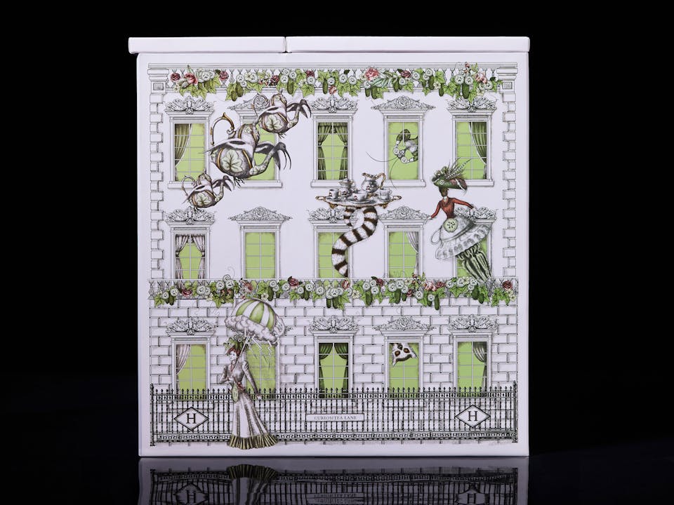
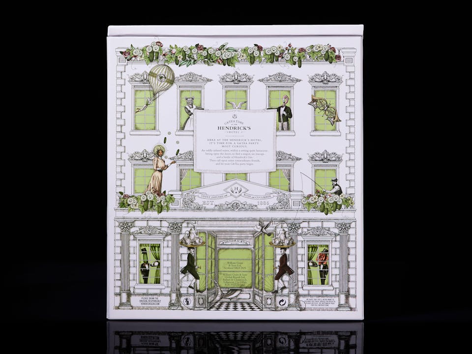
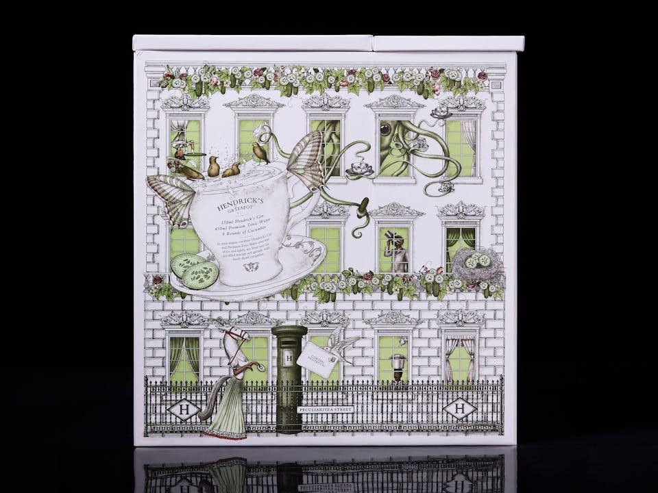
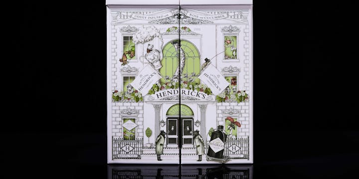
We created ‘G&Tea Time at the Hendrick’s Hotel’, a special collectible pack imbued with rich visual storytelling and the brand’s signature curious touches, crafted to delight the luxury audience.
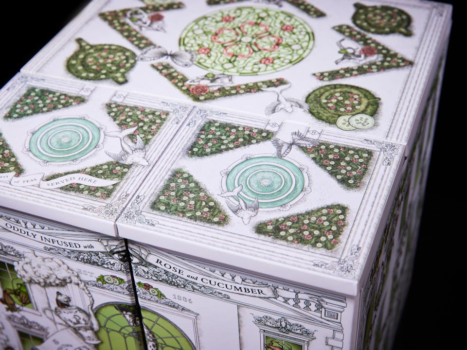
‘OPEN YOUR MIND AND STEP INSIDE’
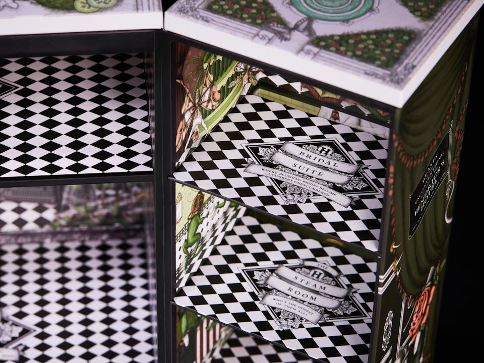
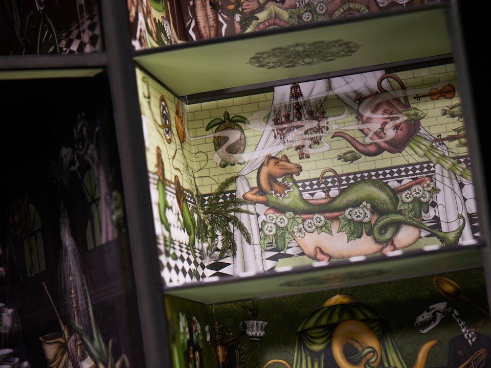
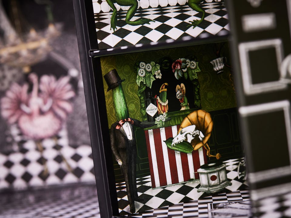
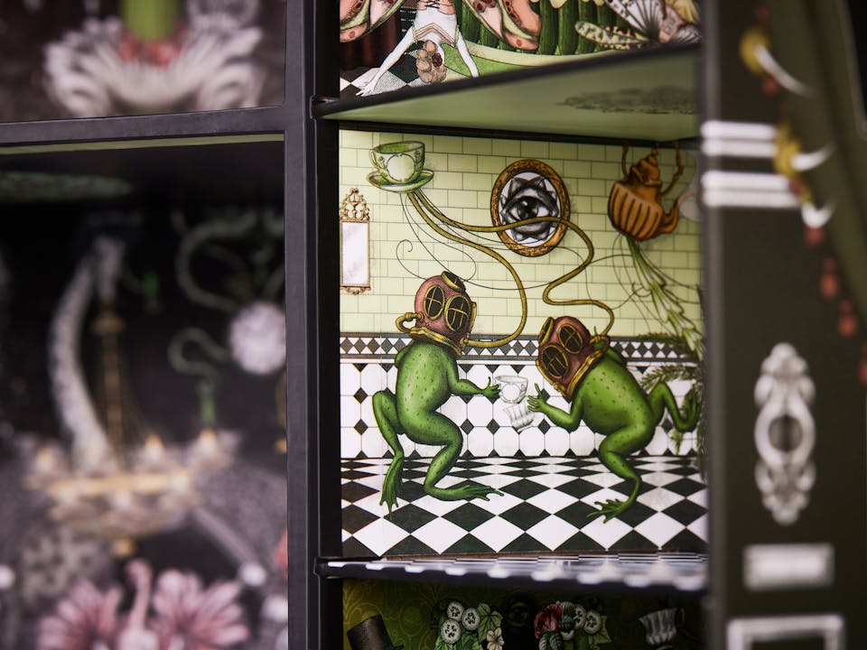
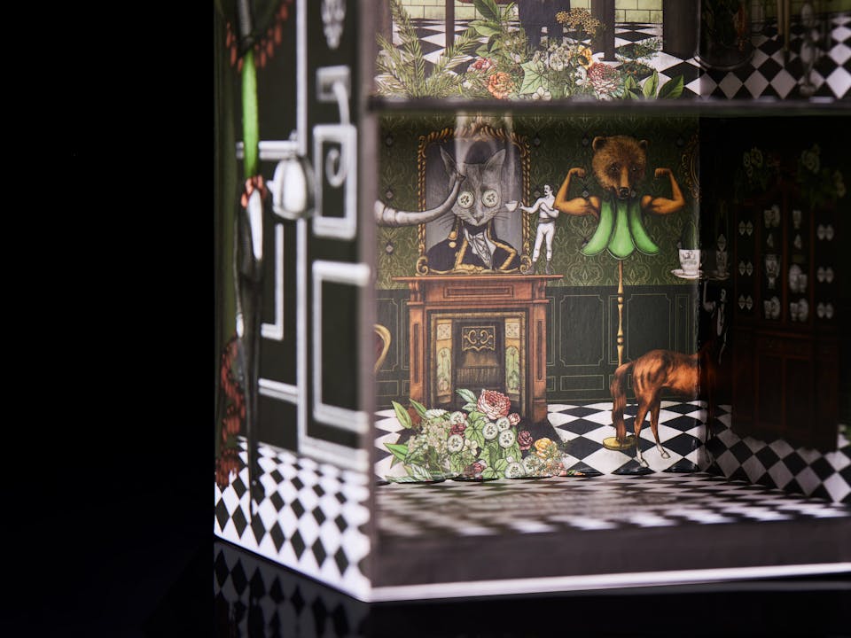
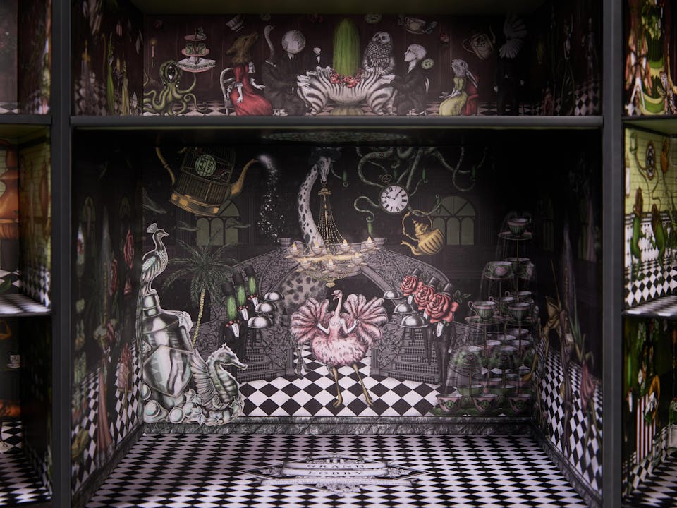
The Hendrick’s Hotel is a bespoke structure that houses a tea set (a bottle of Hendrick’s Gin, a porcelain teapot and six delicately decorated teacups and saucers) and doubles as a show-stopping display case, perfect for any home bar. Inside, each room of the hotel is designed to charm the owner and their guests with intricate illustrations and the brand’s uniquely eccentric tone of voice.
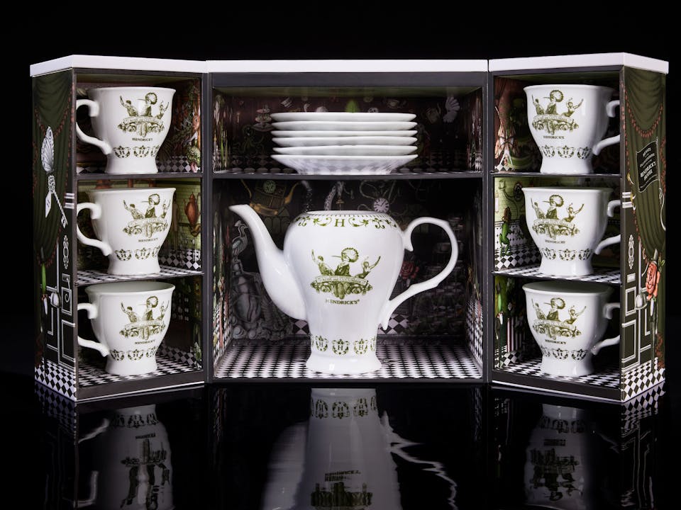
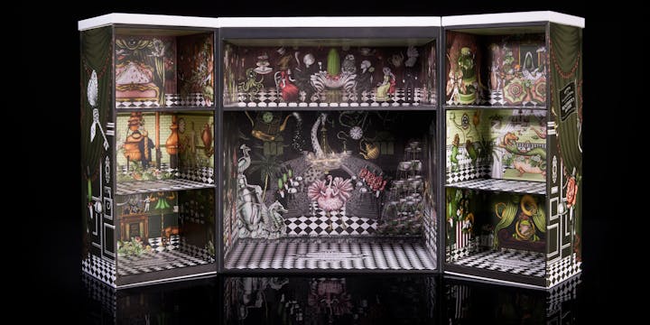
We commissioned Carmen Ziervogel, a freelance illustrator and creative based in Cape Town, to bring this sophisticated, mildly absurd aesthetic to life. Her illustrations are complemented by cryptic and allusive copy lines. The hotel’s ‘Master Suite’, for example, is the place for “a cucumber slumber, to prelude the wonder”.
A PREMIUM PROPOSAL
We know how effective limited-edition packs can be in allowing brands to venture into new spaces and engage new audiences. Building on the popularity of the existing Hendrick’s tea set, but adding an additional layer of craft and theatre, the Hotel enabled the brand to capture imaginations at the luxury end of the market.
