Onside Youth Zones
SALFORD YOUTH ZONE VISUAL IDENTITY
- Brand Strategy & Design
- Identity Design
- Comms
RECOGNITION
-
HideOut Youth Zone
As part of our long-standing partnership with the Manchester Ball charity, we had the opportunity to live up to our B Corp status and get involved in a project that contributed to our local community.
THE CHALLENGE
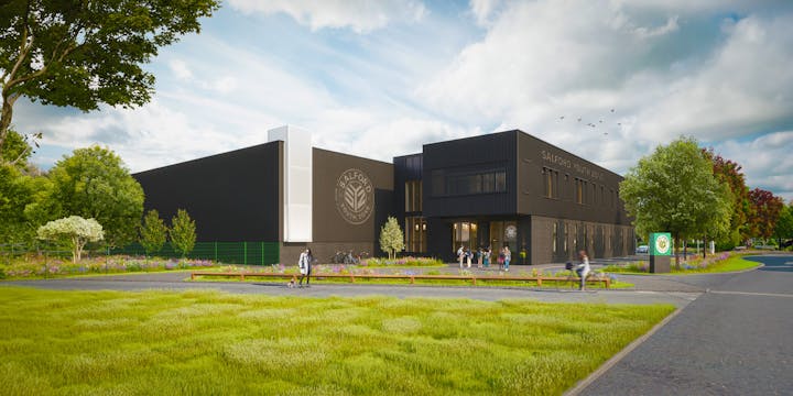
Local youth charity, Empower Youth Zones, wanted to open a new centre in Salford with an original identity that could sit well with their existing sites. They wanted their young people to be involved each step of the way, so working together with the young people who use our city’s Youth Zones most, we created a brand shaped by their experience.
WORKING TOGETHER
We kicked things off by hosting workshops with a group of young people, each covering a different aspect of the process which they were actively involved in: branding, naming, visualising, and finally choosing some favoured routes.
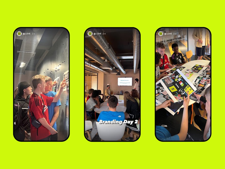
To help our young people begin to understand what goes into a brand, we showed them some of the most iconic brands – dissecting them to see which individual aspects they liked. Helping them unpack a brand world rather than being blinded by their favourite companies, we then discovered which colours, typography and photography styles they were gravitating towards.
THE RESULT
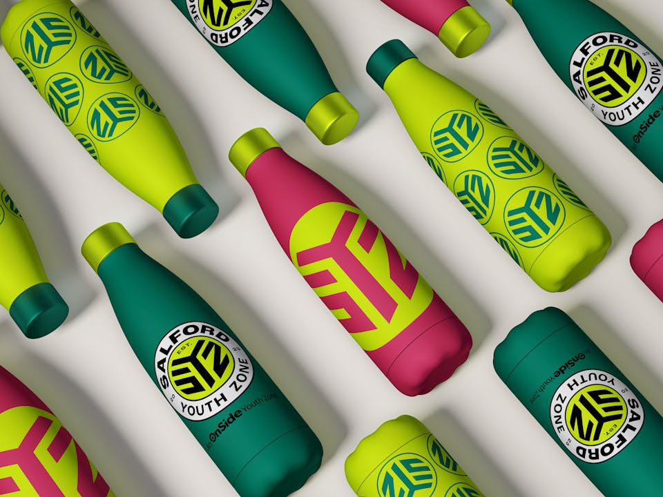
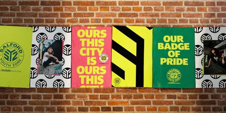
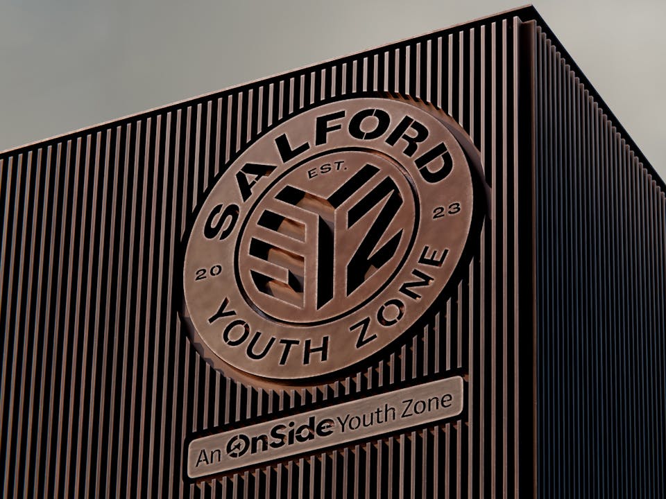
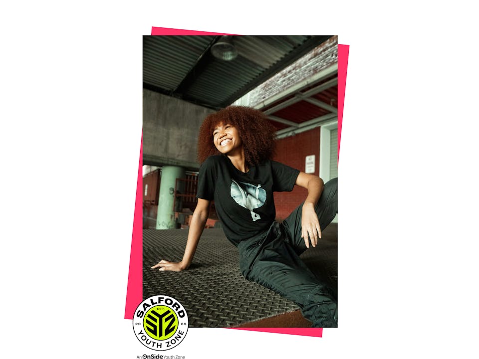
Our chosen name puts the city of Salford first, a clear statement from our young people that they’re proud of their roots. We then turned the initials into a monogram, creating a vibrant and modern stamp to leave on their city.
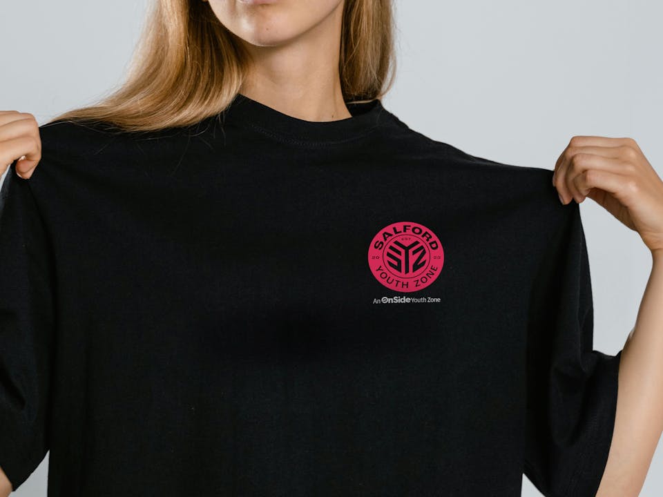

Throughout our brand we used bold and confident typography, with vibrant colour to reflect the energy of the Zone. Our monogram logo could also easily be turned into merch and worn like a badge of pride, showing up on tote bags, posters, water bottles and t-shirts.