William Grant & Sons
WILDMOOR
- Brand Strategy & Design
- Identity Design
- Packaging Design
- Spaces
- Comms
- Activations
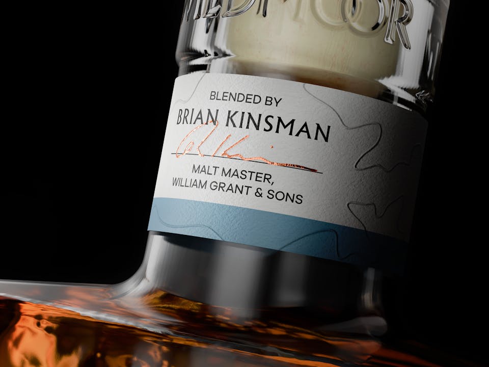
William Grant & Sons have built up an unrivalled stock of high-aged single malt whiskies, some of which, under the expert stewardship of Malt Master, Brian Kinsman, have been lovingly blended to be reflective of the epic, rugged beauty of Scotland’s wilder places. A precious flavour map spanning mountains, moorlands, forests and coastlines.
THE CHALLENGE
Our job was to help fashion these stocks into a new-to-world brand that would reflect both the incredible liquid craft of these whiskies and the wilderness inspiration that sits behind them. A brand that would confidently sit in an emergent world of luxurian exploration and escapism.
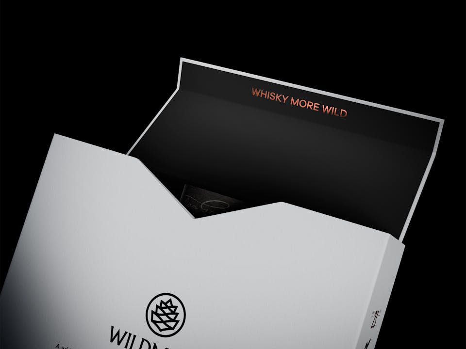
The project scope spanned brand strategy, naming, identity design, glass structural design, packaging, art direction, photography, key visuals and retail design - all housed within a comprehensive toolkit for markets to activate.
A job as epic as the whiskies it served to promote.

THE NAME
In a world where every possible name under the sun is taken, we were pleasantly surprised to discover our favourite ‘Wildmoor’, wasn’t. A name that was strong, emotive and spoke of ruggedness and a certain heathery sweetness.
THE IDENTITY
The Wildmoor wordmark has a chiselled-from-stone aesthetic that gives it an enduring, timeless quality and is paired with a secondary icon, the Scots pine cone. The pine cone is formed from ‘W’ and ‘M’ shapes that also suggest mountains and valleys.


ART DIRECTION
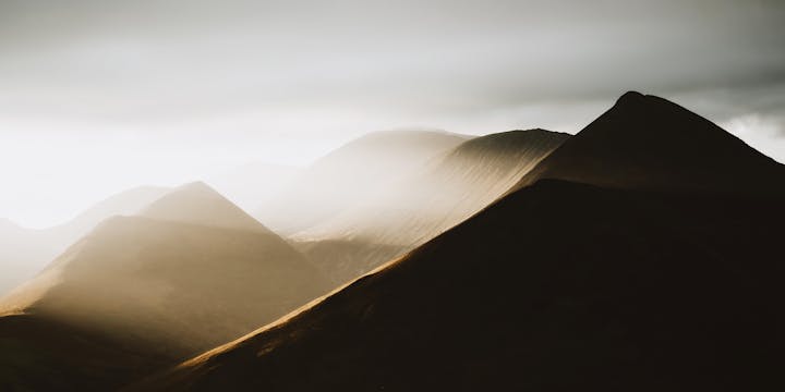
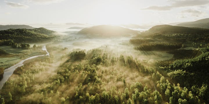
We’ve all seen the tourist-friendly photography of Scotland’s highlands - sun gilded glens framed against deep blue skies and wreathed in vivid purple heather.
But Wildmoor isn’t for tourists, it’s for a certain type of luxurian with a discerning eye for something more authentic, real and elemental.
This meant working with a specialist wilderness photographer who understood this implicitly. We set out on a month long photographic expedition to capture the rugged beauty of Europe’s last true wilderness - from Skye to Assynt, Kintail to the Cairngorms. Coast to coast, river to forest, moorland to mountain top. From widescreen panoramas to macro textures.
The results revealed a version of Scotland not previously celebrated in the category.
Photography and Video content captured by Alice Greenfield and Sam Morris from Adrift Visuals.


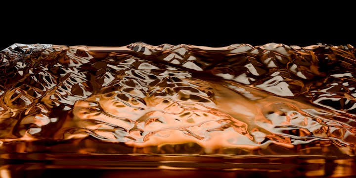

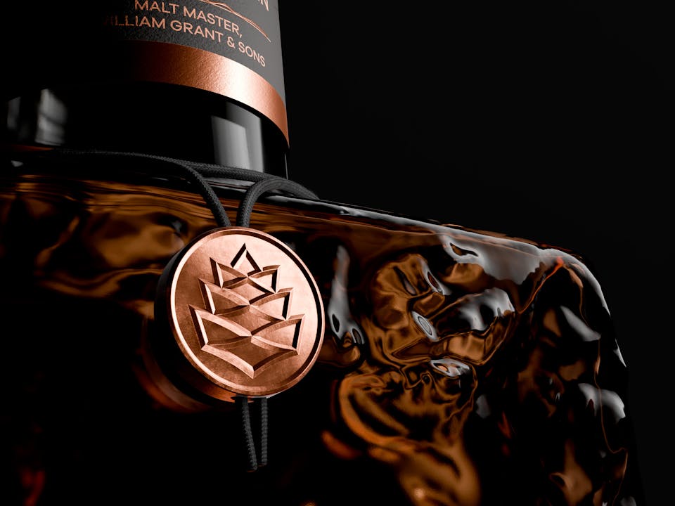
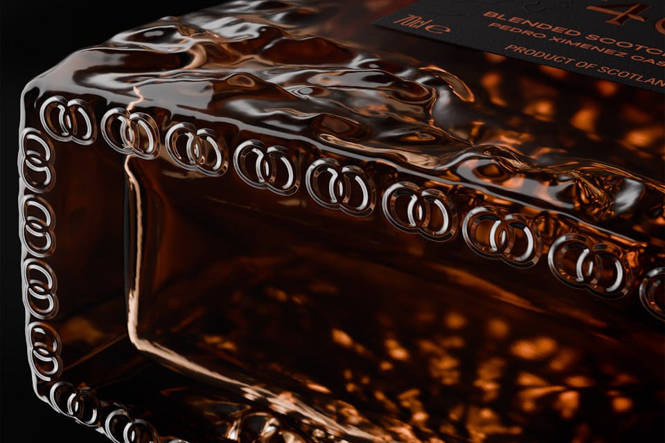
THE BOTTLE
We set out with an ambition to create a bottle that would feel like it had been cut from the very landscape it sought to express. We used an open source topographic model of Scotland’s central highlands to give us an accurate three dimensional relief that we could apply to the bottle surface.
The labels and closure were kept simple and pared back, allowing the beautiful, topographical feature to dominate.
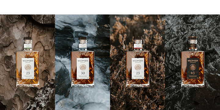

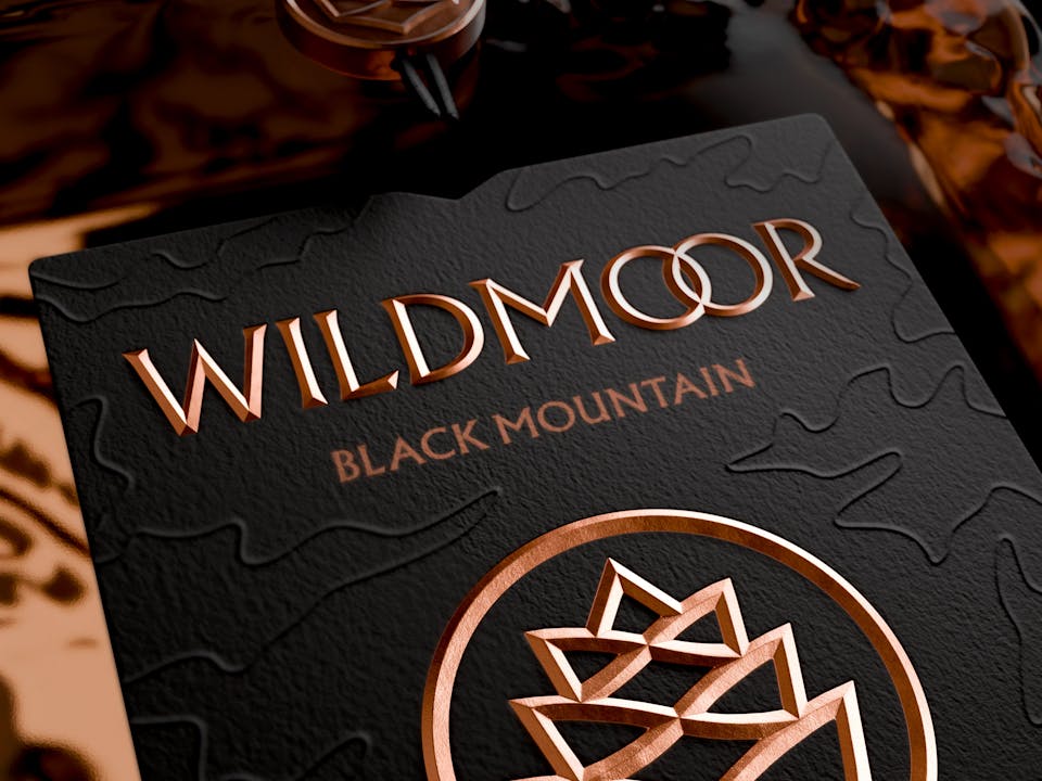
OUTER PACKAGING
When it came to the outer packaging we pursued a clean, modernist aesthetic with the beautifully evocative photography doing all the heavy lifting.
Each variant was named according to its geographical inspiration. Ancient Moorland, Waking Forest, Rugged Coast, Dark Moorland, Tropical Coast, Heather Valley and Black Mountain with the corresponding photographic panoramas there to complete the story.


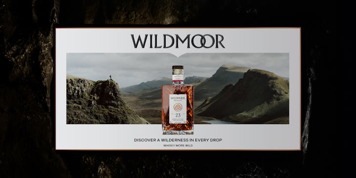

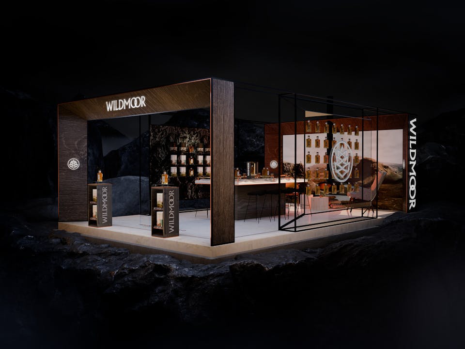
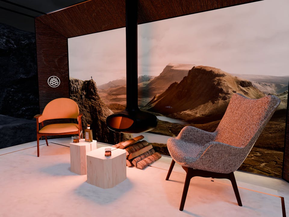
RETAIL AND ACTIVATION
The concept for the retail design was to create a sense of being inside a contemporary Scottish bothy looking out through a window to a wilderness beyond. We adopted a modern, minimalist approach with restrained, simple visual merchandising combined with confident, impactful branding.