Barilla
BACK TO NATURE REBRAND
- Brand Strategy & Design
- Identity Design
- Packaging Design
- Comms

FEATURED IN
-
Dieline, Creative Boom, World Brand Design Society, TrendHunter, Transform
Back to Nature was struggling to turn decades of cult appeal into taste appeal. We gave it a personality-packed rebrand that made them talk of the snack aisle once again.
THE CONTEXT
Back to Nature has been serving up wholesome snacks in the US for over 60 years. Its focus on remaking the classics with honest-to-goodness ingredients had earned the brand cult status among families wanting tasty, junk-free options. But over recent years, it has lost its way. Cult appeal is no longer enough to cut through on packed grocery store shelves (where the likes of Target and Whole Foods have upped their ‘private label’ products and packaging design game). It was time for a bold reset.

THE CHALLENGE
Despite its pivotal role in the natural foods movement and long-standing retail presence, Back to Nature was having an identity crisis. Sales were suffering as a result. Its products were as tasty as the conventional snack staples, but subdued packaging and messaging had it rooted on the dated, duller side of healthier snacking. The brand lacked appeal on all fronts. Ultimately, it was failing to connect with casual snackers and mindful eaters – the very people its products were made for. We needed to restore Back to Nature’s mojo before it fell off everyone’s radar.


OUR APPROACH
In a sea of white-boxed sameness, Back to Nature’s existing brand was struggling with recall. Most people (according to research) couldn’t remember the brand name even if they’d purchased it previously. We had a thought: why does a ‘free from’ brand have to look so washed out, unmemorable and unappetising? Why couldn’t they feel ‘full of’ instead? We began looking for inspiration back where it all began, crafting a definitive origin story to recapture some of the sunny, free-wheeling Californian spirit that would breathe new vibrancy into the visual identity and comms.
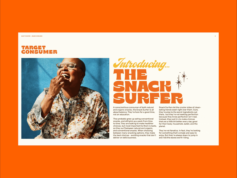
Alongside this, we defined a new target audience: the Snack Surfer. Keen to go toe-to-toe with the conventional big-hitters, as well as popular natural and organic brands, we focused our strategic and creative efforts on catching the finite attention of these most active and open-minded snack aisle browsers.
CALIFORNIA SOUL
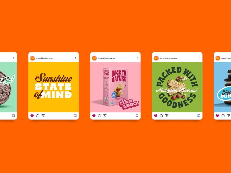
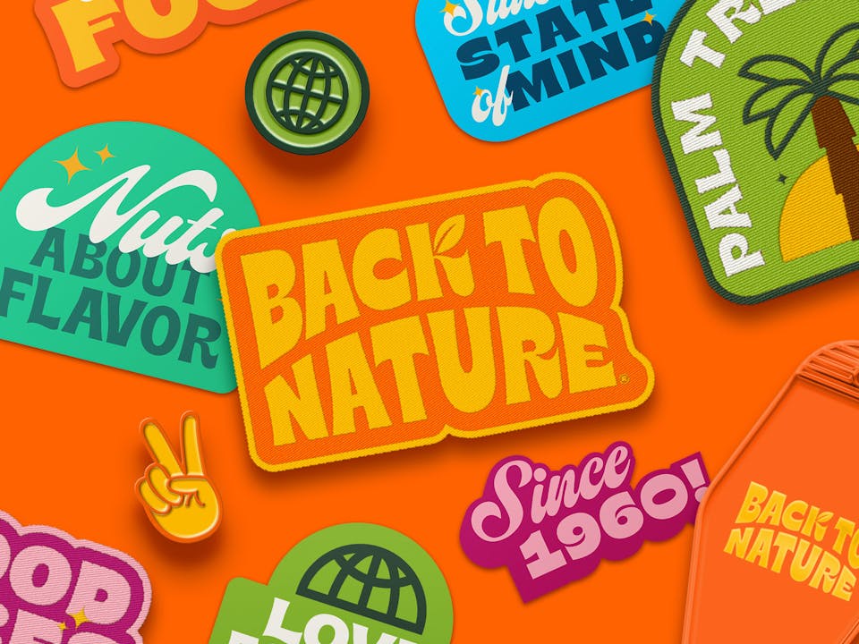
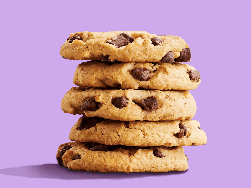
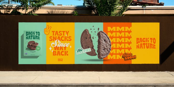
The resulting identity is a clear embodiment of 1960s California characterised by a laid-back, ‘modern retro’ look and feel. Across the board, a palette of super-bright, punchy colour – each individually chosen for their visual links to the West Coast – was implemented, while delicious, shadow-heavy product shots were directed to dial up the sunshine and taste appeal on pack. A whole suite of key brand assets was also crafted, including a sea of vibrant stickers designed to ramp up brand personality.

NEW LOGO, NEW LEAF
The new logo helps to underpin the look and feel. With a shape inspired by the Californian sunrise, its typography taps into vintage-style sign writing, reminiscent of old-school screen prints. Almost a complete overhaul, we kept only one asset from the original branding: their iconic leaf. It was a neat, evergreen nod to Back to Nature’s pivotal role in kick-starting the natural foods movement.
SUNSHINE LINES
We also gave the brand a bold new tone of voice to bring our consumer strategy to life and chime with the bright and breezy, easy-going visual identity. Along with a raft of fun-loving, sunbaked lines riffing off the new brand identity, we landed on a new strapline, ‘Tasty Snacks Since Way Back’, which ties everything together – past, product, personality – perfectly.


THE RESULT
Back to Nature has a brand that cuts through on shelf with a super positive and fun vibe, finally looking just as good as it tastes. The new branding was rolled out across packaging for over 30 product SKUs, including cookies, crackers, nuts and granola.